Pantone Creates New Wine-Inspired Color
Wine has helped fuel many an artist's creative endeavors. And now, a particular wine is the muse behind a new unique color from the Pantone Color Institute.
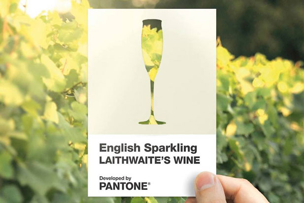
Pantone partnered with Valspar Paint and Laithwaite's Wine to develop English Sparkling Laithwaite's Wine. The color takes its inspiration from the shade of Wyfold Vineyard by Barbara Laithwaite -- one of England's most awarded sparkling wines.

Pantone said English Sparkling is "a subtle and stylishly elegant, creamy hue that quietly expresses effervescence and good taste. Young in spirit and timeless in its appeal, this natural off-white shade conveys feelings of spring freshness and modernity. Carrying an undertone of pleasantness and geniality, the inherent warmth of Laithwaite's Wine English Sparkling creates a sparkling yet soothing presence."
Available as paint from Valspar, the new hue could harbinger forthcoming color trends in the apparel world – something promotional product distributors whose clients have fashion-forward tastes and audiences will want to be aware of.
"English Sparkling is more than just a new shade of Valspar paint. Like every bespoke color we mix, it's about eternalizing a personal feeling, a moment in time, a memory," said Kasia Wiktorowicz, marketing communications manager at Valspar. "For us, this color is reminiscent of a warm laughter-filled summer's evening, enjoying an English Sparkling wine with close friends and family."
The new hue is also serving to promote English sparkling wine, elevating it into the official pantheon of color terminology in a manner akin to continental rivals like "burgundy" and "champagne."
"Just as burgundy and champagne are very well-known terms for colors, it's now time for English Quality Sparkling Wine to take center stage," David Thatcher, CEO of Laithwaite's Wine, was quoted as saying. "Creating an official color is a great way of acknowledging the ever-growing popularity of the English wine industry around the world."