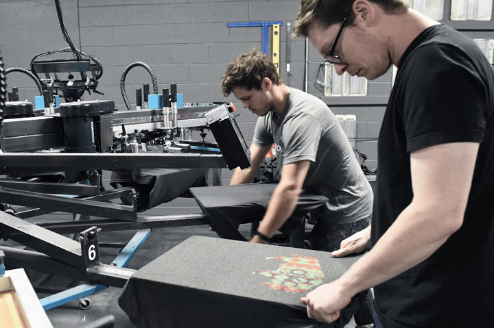
Decorators View - Navigating Graphic Placement on Apparel
In this new series of columns, decorated-apparel industry veterans share tips to help promo distributors ensure that logos look their very best.
Have you ever requested a logo be printed in a certain spot – perhaps across the back of a hoodie – only to receive finished garments with artwork inches off the target location? Graphic placement on shirts and other garments can sometimes be an arbitrary decision, or even just a personal preference, by your chosen decorator. But promotional products distributors can specify their own requirements when ordering contract printing. The important thing is to make sure you and your decorator are on the same page and speaking the same language.
Consider these suggestions for a variety of graphic sizes, locations and garments to help ensure artwork is sized and placed properly.

Graphic placement can vary from one decorator to another, so it’s best to specify your own preferences.
Large full-chest designs, in the range of 10” x 12”, will look best printed approximately 2” from the base of the collar. Shorter, wide graphics across the chest should be printed about 3” from the collar. Sweatshirts should be printed lower by about 1”, since they are not tucked into pants and therefore have a larger printable and visual area.
Left-chest designs should be centered between the vertical centerline of the shirt and the seam attaching the sleeve to the shirt body. Larger left-chest designs should be printed on an imaginary line from the bottom of the sleeve at the point it attaches to the shirt body. Smaller left-chest designs should be printed 1” above this imaginary line. This left-chest placement also applies to placket shirts, such as polos. Some printers attempt to line up graphics with the shirt placket, but visually, placement should be a function of the imaginary line from the bottom of the sleeve.
Pocket prints are generally printed in the center of the shirt pocket. For prints above the pocket, it should be approximately ¾” above the top of the pocket and centered with the physical pocket. Not all pockets are perfectly square with the shirt, but the image will look best squared with the actual pocket, rather than attempting to square with the physical shirt.
Sleeve graphics on short-sleeve garments are almost always printed on the left sleeve when given the choice. These graphics should be printed 1” from the hem at the bottom of the sleeve. For long-sleeve prints, the graphic is commonly centered on the sleeve between cuff and shoulder.
Back prints should be printed as if you are looking through the shirt at the front print. In other words, the print on the back of a shirt will be further from the collar than the same print on the front. Large, full-back designs should print approximately 4” from the collar base. Short, wide designs should be printed about 5” from the collar. Shoulder-blade prints, most often a wide graphic of single-line type, will be located about 2” from the collar base. Take special note of back-print location. Decorators will commonly print the same distance from the collar on both front and back prints, but this results in a finished product that appears out of balance, front to back.
Shorts should be printed 1” from the bottom hem and either 1” from the side seam or centered on the leg, depending on the look you’re trying to achieve.
Sweatpants should have a small graphic printed with the bottom of the graphic on an imaginary line 2” below the crotch of the garment and centered on the leg. Long prints can be printed either on the front of the leg or the side, and placement is commonly the preference of the customer.
Youth designs look best when printed 1” from the collar base for a full-chest graphic. Short, wide prints should be printed 2” from the collar base. As a rule of thumb, the graphic should have less distance from the collar to the graphic than from the graphic to the shirt bottom. Even if that requires decorating closer to the neck, having more open space at the bottom of the graphic than the top is more pleasing to the eye. This is only a concern when decorating very small garments.